"Never judge a book by its cover."
We can throw that right out the window. We all do it, and no longer in books. In games, people often see a pretty icon and download it instantly. First impressions can be crucial, and you don't want your icon lacking quality, or your title unpronounceable.
What Makes a Good Icon?
Tell a story in 100x100 pixels. That can be hard, but it can also be a fun challenge. Let's talk through some popular games and their icons. Some of these are from FGL and their list of 100 best/worst icons.
Moving onto the "Meh" category. These ones lack pleasant colors and contrast. The second one, Flow, is a fairly popular game on mobile currently, and their icon definitely mirrors how their game looks, though it can be more appealing, Tank War is a bit too green, at least the text could use a boost in brightness.
Good Examples
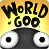
Look at how bright and vibrant the colors are, as well as the contrast these icons make. You don't need to tell me anything about it, their looks alone would make me hit the download button. Might be the worst game ever, but overall, icons of this much quality usually end up being well made games.
Alright Examples
Moving onto the "Meh" category. These ones lack pleasant colors and contrast. The second one, Flow, is a fairly popular game on mobile currently, and their icon definitely mirrors how their game looks, though it can be more appealing, Tank War is a bit too green, at least the text could use a boost in brightness.
Poor Examples
Not sure if I even need to explain these ones. Couple things I can say is, never use in game footage. Don't screencap your game and cut out a box you think is most interesting. If you really want to crop a part of your game, you should consider composing the scene to make it more interesting, and then editing it a bit to make it even better. Unless you make a game that's heavy on the art, I doubt this approach will work out for you. Some icons also go heavy on the gradients. At some point, it's too much or too sharp of a change, so try to avoid that.
My Examples
Good
I don't know why, but I'm a big fan of blue/orange colors. Maybe it's because my school colors where that, or I played portal too much. I usually like taking an assets I've made in the game, and editing it in photoshop to add more depth. It's kind of boring seeing flat colors, so I add gradients and brush strokes everywhere to make it not so plain.
I've been told these look good, but when they started, they're terrible. You just keep working at it and add detail until you get to a nice point. I probably spend a minimum of 5 hours on each icon, which might be overkill, but I want to make sure that the first thing people see is as appealing as possible.
Alright
Following the same theme of contrasting colors, but could've been done more effectively. One important thing I consider when making the icon is, how can I add the theme into the icon? It's nice to make an icon that causes people to imagine what kind of game it could be. It's like inception, but with games. They might have never heard of your game before, but if you've integrated your mechanics or story into the icon well enough, your audience might understand your game before pressing your icon.
Bad
These ones are either very old or I haven't tried much. All of them I just took a screenshot and cropped a part I thought looked more interesting. They're still better than some icons that don't even try. If your game doesn't have an interesting enough section, then you really need to compose something from scratch, or a few assets you've got drawn.
My Process
I mentioned briefly how I make icons but let me go a little more in depth. Fire up Flash.
The bare minimum size for an icon should be 200x200, but making the image in vector is always superior as you can scale it to any size you want.
The bare minimum size for an icon should be 200x200, but making the image in vector is always superior as you can scale it to any size you want.
Sketch: Like most things I do, I begin with a rough composition of the icon I want. Light colors to get an idea started and then a darker color to refine the sketch.
Compose: I then start making the final drawing. I try to disregard the colors at first because I want to focus on the drawing more, but I do consider it more as I draw. Colors are very important for an icon, so you can't leave it for the last thing you do. It might help to block in a few colors to see if the image contrast well and the colors work well together.
I try to keep things in separate layers, which helps when I want to rearrange things and when I export the images individually. In photoshop, I still do a lot of rearranging.
Refine: After I'm more or less satisfied with my drawing, I export PNGs at 300 dpi (I like keeping icons big if I switch to raster). I pop these in Photoshop and start adding shadows/changing colors/painting on them until I'm happy enough with how it looks. Sometimes I give up and try another day, a fresh mind usually helps me make better stuff.
I'll end up with an icon that's 5x bigger than what I need, but at least I had fun doing it and once we have ultra hd tablets, I can still use them.


0 Response to "How to Make Game Icons"
Post a Comment